Saturday 3 December 2016

Week 9: Worcester Museum

WEEK 9 - WORCESTER MUSEUM OBSERVATIONAL DRAWING TRIP

Week 8 was Peer Assessment, so week 9 was our next drawing week. The class took a trip to worcester museum and undertook a number of tasks. The task was designed not just to improve the skills we had learnt during figure drawing, but to apply them to other subject matter, and be able to draw observationally. This is a vital skill for working with briefs, as often it will require visual research and drawing objects or people from a partiucalar place/time period/environment, etc.

TASK 1: 'Depict an object that you feel symbolises nature. Try to draw this as large as possible.'

30 MINUTES / 6B & 4B PENCILS
I was struck by this enormous mounted lion's head and really wanted to attempt to capture the beauty and overwhelming power of it. I chose 6B and 4B pencils in order to work with loose, heavy strokes and give the essence of the mane without adding too much detail. I think these mark-making techniques work well with the subject matter, giving the drawing a raw and powerful feeling of movement.

TASK 2: 'Depict an object that you feel symbolises the phrase 'man-made'. Try to draw this as large as possible.'

40 MINUTES / 4B PENCIL
For this task I didn't think you could get more man-made than the beautiful smooth carving of a violin. I thought it would be something very interesting to draw seeing as there are such a variety of angles, lines and shapes within it. However, I found that coming to draw it, this was a lot harder than expected. The angles gave me lots of trouble, especially trying to get the object to look 3D as it was foreshortened from where I was sitting. I always tend to have trouble with this and despite trying to use skills from class, the drawing still looks a little off. This is something I'd like to try again, so I took a photo and will attempt to improve it at home. I may draw the violin smaller too, so I have enough space to fit it on the page - I don't think this helps as the violin looks squashed at the end. I also don't think the heavier pencil marks work very well for the piece, so I'll choose a more delicate medium.

TASK 3: 'Draw three or more different objects on a page that you feel symbolise nature. Really consider where you place these elements on the page.'

(Top to bottom) 20, 25 & 15 MINUTES  / XS & S BLACK FINELINERS
After the slightly disappointing second drawing I am a lot happier with these. The change in medium to fineliner pen was a strong decision here because there is so much detail to be seen and the fine lines bring it out beautifully. I was able to use shading/hatching techniques for tone and depth, which was useful practice for tonal study.The bat was particularly beautiful to draw, as the wings were so translucent and caught the light which highlighted hundreds of tiny veins within. Therefore I spread the bat across the page so it had the main focus, and framed it with the other two drawings. 

TASK 4: 'Draw three or more different objects on a page that you feel symbolise the phrase 'man-made'. Really consider where you place these elements on the page.'

(Top to bottom) 10, 20 & 20 MINUTES / 2B PENCIL, BLUE BIRO & CHARCOAL
I experimented a little more with mediums for these drawings. I tried to find a variety of items to symbolise man-made, and then base my medium choice on the item itself. I think the most successful is probably the pair of boots, because the soft, messy style of charcoal captures the creases and shadows on the leather well. The shoes were also black with long, loose laces, and I think you get a sense of this just through the charcoal itself. The foreshortening was still tricky but I do find this drawing more accurate and successful than the violin foreshortening!

The gun drawing works well with the more detailed biro, and the clarity of line that biro gives captures the complex design well. I think this would have been very strong had I managed to fit it all on the page - this is a weakness of mine I continually recognise and need to keep improving upon!! The medal drawings in contrast are nicely spaced on the page and I think overall the page drawing works well; however I will admit to rushing the medals a little bit in order to be finished within the museum's closing time! Therefore I think I could have been more adventurous with my medium as well as my drawing style here.

HOMEWORK

TASK 1: 'The people that visit and the space itself (the interior and exterior architecture of the building) can also inspire interesting studies and observations. I would like you to complete 3 studies of people on 1 A2/A3 page and 3 studies of the space on an A2/A3 page. Spend at least 10 minutes on each drawing.'

MAX. 2 MINS EACH / HB PENCIL
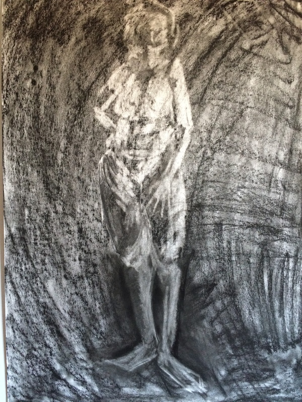
I would have liked to do many more studies of people for this task, as I find observational life drawing very helpful for practising proportion and speed drawing skills, but unfortunately when I went there were not loads of members of the public looking round. I also found it hard to spend 10 minutes on each drawing because the people were constantly moving; this is why the drawings were only about 2 minutes each. Even so, I am happy with the drawings and feel that they look quite accurate and lifelike in the way I've caught poses or movements. This sort of drawing is something I will be continually improving on but I do feel that I have found my style and what is most effective for me.

I didn't manage to make the location drawings on that day due to lack of time, but I have taken photos and will be completing these studies at home (to be uploaded soon).

TASK 2: 'Make at least one drawing from each of the following categories: BIRD/ MAMMAL/ WEAPON/ HEADWEAR/ BOTTLE/ CLOTHING.'

20 MINUTES / 4B PENCIL

BIRD - For the bird I chose to draw this huge gull spread across one of the walls in the museum. The wings were so huge and gave some beautiful shapes and curves. I did manage to fit the drawing across one A3 page, although once again could probably have gone slightly smaller so it wasn't squashed at the edges. I don't think this drawing is my best - I like some areas, like the mark-making on the tail and body, but the wings probably aren't as detailed as they could have been, and the perspective appears slightly off.

(TL - 20 MINS, TR - 20 MINS, BR - 10 MINS) 2B & 4B PENCILS

BOTTLE / MAMMAL / WEAPON - I'm not entirely sure why I chose to draw all of these objects on one A3 page - looking back, I wish I'd taken a page per object and really focused on the details. I also wish that I'd thought to try other mediums so that the drawing style suited the objects more. Had I spent longer per drawing I think I could have been more accurate with tone and proportion. Despite this, there are some successful elements. The bottle is probably my best work of the 3, as I think I've captured the 3D perspective quite well by leaving large areas of paper showing through carefully placed lines. The stoat has a nice form but I'm not massively happy with the face. It had a very interesting snarl that I struggled to recreate and it's lost in dark shading, I think. The dagger is also interesting but looks a little rushed, and fineliner or watercolour would have done the delicate sharp edges more justice.


CLOTHING / HEADWEAR - Once again I placed multiple drawings on one page but considering these two relate to a similar theme, I actually find the composition quite effective. The pencil also works successfully with the subject matter, because it enabled me to capture the many folds and shadows in the material. I like the way you can alter pressure with pencil to make some areas sharply defined while only suggesting the outline of others. This is especially noticeable in the righthand drawing by drawing focus to the main subject which is the headgear, but still giving context with some softly suggested clothing. To improve these drawings I would consider adding colour. The jacket on the left was a gorgeous deep red with gold embellishments, so I think acrylic or goache would bring this to life.

Wednesday 16 November 2016

Week 7: Working in Layers

This week was another that I was really excited to take part in, as I hadn't worked with paint yet due to missing last week's session, and it's a medium that I enjoy. Something that I frequently try to experiment with when painting is working in layers, but often find it difficult especially knowing where to start. Therefore, this session was hugely useful as a starting point!

To begin the session we made a series of very quick 1 minute drawings in close succession, all on the same page. This gave us a really nice composition of pose practices, as well as serving as a good warm up exercise. The life drawing for homework had definitely got me more used to having to make drawings of figures very quickly, and I could really feel this practice helping me during the task. I found I was a lot more confident with my mark making and knowing how to approach certain positions than I had been in the first few sessions, and it was very inspiring to notice the improvement!


We then made 3 more studies of 5 minutes each, again on one page. I enjoyed drawing these, as I had time to add some tone and bring them to life a little more. Having more confidence with my faster drawings meant that my results on the whole were proportional and full of movement and life. Comparing this to my early life drawing technique, which was very stiff, these actually reflect a real person.


After these exercises, we moved onto our first painting. I chose to use goache for this, as I was feeling eager to use vivid colours and wanted to include some texture, which needed thicker paint. Ideally I would have chosen acrylic, but unfortunately I didn't have any with me. I hadn't used goache much before, but found it an enjoyable, smooth paint to work with. I liked that it blended more like watercolour, but still dried opaque and textured like acrylic. This meant that I could layer colours well. This painting required us to use two contrasting colours including white, so I chose a bright green and purple.

For the first 10 minutes of the painting we blocked in darker tones with one colour, then for the next 10 we went in with lighter tones with the other colour. I chose the purple for dark tones and green for lighter mid tones. The white was added last for highlights. My choices worked well, because they stood out beautifully from the paper and the white, without being too dark that they couldn't be layered. As a result, I am very pleased with my result. I ended up leaving some paper showing through on areas of the figure, which at first I thought had been a mistake but later looked again and think it's very effective. It links the figure nicely with the plain background and adds an extra layer of tone which isn't necessarily highlight but appears considerably lighter. It gives the figure a very 3D effect.

30 MINS / COLOUR TONAL STUDY / 2 COLOURS OF GOACHE AND PENCIL
The next painting had the same restrictions, but this time I chose orange and blue to go with the white. I liked how the complementary colours of green and purple worked last time, so that's why I chose two complementary colours again. I decided to switch to watercolour, which allowed me to create some thinner layers and looser control of the paint. Something that I liked about using these two colours is that the thinner paint overlaid to create a new colour; a kind of olive green. This picks out certain areas quite nicely, adding an unintentional mid tone which is consistent with the colour scheme of the rest of the image! I framed the figure using the two colours I'd chosen for shadow and light, which I feel is effective at giving some context and projecting the figure from the page. I do however, wish that I hadn't changed my technique from the painting before; because of leaving paper showing last time, I decided this time that I would fill every space within the figure with colour. This does help make the body look more solid - however I feel that it also flattens the shape as the white is hard to pick out and therefore highlights are a little lost. I compensated for this by darkening some of the shadows, and it's by no means a bad piece in my opinion, but it's an example of overworking a piece that didn't need so much paint.

30 MINS / COLOUR TONAL STUDY / 2 COLOURS OF WATERCOLOUR AND PENCIL

CLOSE UP OF STUDY / I feel this area is particularly strong in terms of tonal contrast and highlights!
A further example of this is the next painting, which I feel is probably my weakest of the session. This painting didn't have any colour restrictions, so we could use however many and whichever colours we wanted. I didn't want to lose the impact of a simplified palette, as I liked how this worked in the first two, so I only chose three colours and then white, Again, I used watercolour, which I don't think was a good choice here, as it ended up just creating a light wash on some areas, and I didn't find I could build it up as well as thicker paint.

30 MINS / COLOUR TONAL STUDY / THREE COLOURS OF WATERCOLOUR AND PENCIL
Nevertheless, I tried to make the best of it, and some parts are pretty successful - for instance, I like the foot tucked under the body, where you can still see some loose pencil showing through. This is an example where the watercolour could work well if better handled. I also like the bent arm, where the elbow is nicely defined with a splodge of deep red and protrudes from the rest of the body in a good example of foreshortening. However, other areas are lost in colour as the colours are all too similar, so the highlights don't show very well. It's a shame because it was a nice open pose!

CLOSE UP OF STUDY / This is one of the areas I still quite like, showing that the painting has potential and I can learn from it for next time.
After my disappointment with the previous painting, I wanted to make sure I didn't make the same mistakes with the final one, so I reverted back to goache. Instead of similar colours, which I'd learnt to avoid, I went back to using  complementary colours, and chose a blue and ochre brown. I did choose a third colour, a kind of teal, but reserved this only for the background. I also used white for highlights. This pose was nice to paint, with lots of tonal contrast. I didn't try to fill in all areas of the figure, learning from my mistakes, and immediately the outcome became stronger. The background works well I think, because it has enough similarity to the other colours to give a sense of consistency, without everything else blending back into it.

30 MINS / COLOUR TONAL STUDY / THREE COLOURS OF GOACHE AND PENCIL
CLOSE UP OF STUDY / I'm very pleased with this example of tone especially, where I managed to capture the gracefulness of the foot using only tone and very little line!

I found the technique very effective. I really loved having the time just to focus on one tone at a time, because you could really think about where you were putting it and which was accurate, etc. I learnt lots about colour schemes, as well as highlighting, mark making and layering.


Saturday 12 November 2016

Week 6: Homework

Cafe Drawing

Unfortunately I missed the lesson on this week's Monday; however I was still able to complete the homework task to practice life drawing outside of class.

We had to go to public places such as around campus, cafes, parks, buses, trains, etc, and make drawings of the people in those places. As people out and about are almost never standing still it makes the task a challenge, but very useful.

As with most tasks, it took me a few attempts to warm up, but once I started drawing I found there were lots of people I could draw. I ended up going out on two separate occasions to complete the task, which was nice because it meant I could go to lots of different locations and see lots of different settings to draw people in. I think that most of my drawings were successful at capturing the busy day to day life of people in public. The mark making is bold and fluid as a result of trying to get down as much information as possible in such a short space of time, which works well for me because if I try to add too much detail I have a tendency to draw from my head instead of from what I can see, and then I overwork things. So with these drawings I am happy that they retained the sense of life and movement that comes with loose sketches.


Something that I do sometimes struggle with with life drawing in this way is that you don't have time to really measure proportions, so a lot of it relies on estimating, based on what your eyes can see. This means that some of my drawings aren't massively accurate. I think this is something that simply comes with time, as you practice skills and eventually it becomes second nature. In any case, sometimes drawings that have an element of distortion or wonkiness can even be more effective than perfect copies, because they have character and charm to them.


This final drawing is a quick sketch I made of my flatmate while she was lying on the bed. It gave me a good opportunity to practice foreshortening outside the class and I think I managed it quite well!

Wednesday 2 November 2016

Bristol Zoo Drawing Trip

On the Monday of Worcester Week (31/10/16) a group of art students from various courses, although mainly illustration, took a trip to Bristol zoo in order to practice our life drawing skills. Animals are unpredicatable, fast-moving and often very challenging to draw with their many strange forms, habits and movements. For these reasons I was both looking forward to the trip but also a little unsure about how my drawing would go, having to be so fast paced and bold. There wouldn't be time to worry about proportion or accuracy, I would just have to trust my eyes.

The trip was a brilliant day. Any worries that I may have had soon disappeared once I started drawing and got into the swing of things. Like any activity it takes some time to warm up, but the trick I learned was just to keep going and pushing through any drawings that didn't go to plan, because I knew that if I made a large quantity of work, I would definitely have something worthwhile to pick out of it. I also prefer drawing faster and slightly more messily, so I found the exercise to suit me perfectly!


Saturday 29 October 2016

Week 5: Homework

Subtractive Tone Self Portrait

For this homework we had to make 5 self portraits using the technique we'd been practising in Monday's class. Two had to be full body portraits to enable us to use our foreshortening and proportion skills.

When attempting the homework, I wanted to bear this statement in mind, given to us on the homework sheet:

'Try to see your (objects) face as being larger than life and having monumental qualities.'

This reminded me throughout the task that the drawing needed impact, and the tonal contrast needed to be dramatic. The drawing should be full of life, emotive and powerful, especially when drawing a face. The homework asked us to consider lighting, angles and emotions when planning a drawing.

I have mixed feelings about my homework pieces this week. In some ways I find them successful and I am happy with how they turned out. But in other ways I think I could have done a lot better and feel a little disappointed.

The close-up portraits are the ones I had the most trouble with. Although not an excuse, I think some of the reason for my struggling was that I had very bad lighting and no moveable desk lamp which I could use to cast shadows and light on my face. This meant I was often drawing one handed in order to hold the lamp under my face, or holding my phone with its flashlight on. This meant I didn't really have a consistent image to draw and the light was often moving. Even so, I managed 3 close-ups each from a different angle. The first is probably the one I'm happiest with - I think the fully white background is effective at bringing the face to the foreground. I was able to capture the hair quite well; it catches the light in a way which I think appears pretty likelike.

40 MINS / CHARCOAL AND RUBBER
The next image was using light shone from underneath. I had a hard time drawing this as I didn't want to move my head from the pose too much but I needed to look in the mirror and look at my paper. As a tonal study, I think the drawing is powerful, with strong areas of dark and light tone and lots of emotion. The gaping areas of shadow around the eye sockets starkly contrasted with circles of light give the face a ghostly, gaunt appearance and this is compelling to look at. However, as a self-portrait I don't find it overly successful because I find no likeness to myself in the image, so I'm a little disappointed with this as that's the aim of the portrait. Despite this, I am glad to have made the drawing as it was a very interesting tonal study to attempt.

50 MINS / CHARCOAL AND RUBBER
I then tried a different expression and drew a sad version of myself. This looks slightly more like me although it still doesn't really have any likeness, which is a shame. From this activity and the first self portrait task, I've identified it as something I need to keep practising. I do like the tone in this image anyway, which was quite fun to study because the face slightly turned to the side created an intense contrast between either side of the face, where one was heavily shadowed and the other directly being shone onto. The light also gave lots of intriguing creases and lines in the face, where the sad expression was manipulating the muscles.

30 MINS / CHARCOAL AND RUBBER
As they hadn't been too successful, it was nice to leave the close-ups behind and move onto the two full body drawings. I don't often choose to do these in my own work, so I really enjoyed it and am inspired to draw more soon! The first one I did was a seated pose, because I was hunched over in quite a constricted position on the floor while drawing and it created lots of interesting tonal creases in my clothes. My foot was also stretched out in front of me so I could work more on my foreshortening skills. I am really pleased with this outcome and think by this point I had definitely got into the swing of the charcoal and rubber method, because I found I could work pretty quickly and boldly. I have to admit I didn't make much use of the measuring methods we had been practising in class, so I think the image could've been made more accurate had I taken slightly longer - however, I can see lots of character in the drawing. I am particularly proud of the hands, where I think my tonal practice really paid off, as they are beautifully defined and full of life. I also like the foreshortened foot, mainly because I doubted my ability to draw it and surprised myself by managing a decent job of it! If I were to go on and produce a more developed and technically accurate version of this piece, I think it would be even more successful.

30 MINS / FULL BODY TONAL STUDY / CHARCOAL AND RUBBER
Finally I drew a standing self portrait, another challenge! This is another piece I am very pleased with. Because I was only using A3 paper, I had to size the figure down to fit onto the page, which meant I couldn't include much detail at all. At first this concerned me, but seeing the end result I think it's a lovely effect, because the figure is defined by broad soft strokes of white and the drawing is almost purely tonal. I could capture the folds of my clothing very well using this technique and you really get a soft sense of light in the image without it being distracted by facial features, lines or detail. I think a few of the proportions could be touched up but with the technique being so loose and abstract I don't think technical accuracy is too necessary here.

25 MINS / FULL BODY TONAL STUDY / CHARCOAL AND RUBBER

Wednesday 26 October 2016

Week 5: Subtractive Tone

This week our focus was on revealing an image using subtractive tone, which is making light marks on a dark background, instead of dark marks on a light background, as is often the norm when drawing. We were using charcoal and covering the page with it, before 'drawing' into it with a rubber.

I found this technique to be one of my stronger areas despite having rarely done it before! It just seemed to work with my preferred style, which is generally more sketchy and rough. I think this is because you couldn't really create much detail with the technique - you just didn't have enough control over the rubber and it wasn't small enough to make delicate marks. You just had to go for it, using broad sweeping strokes. I found that I often had to work quite hard to create some of the lightest areas, which created some really interesting hazy textures and midtones.

My first drawing is probably the weakest of the 4 that we made in the session, simply because it was a pose heavily reliant on foreshortening which, as expressed in a previous post, I find very challenging! The model was directly facing me, and I had lots of trouble getting the legs to look anywhere near accurate. In the end, I decide to leave them and just focus on the upper half. This perhaps wasn't the way to deal with a mistake, but I think the upper half isn't too bad, so the legs were really letting the rest of the image down. I think there could be a greater contrast between the figure and the background, as the darker tones don't stand out too well, but I quite like having this piece as a record of my first attempt and it taught me many things which I think are reflected in my later images.

40 MIN TONAL STUDY / CHARCOAL AND RUBBER
The next study was another 40 minutes, but this one was much more successful. The model was now facing sideways, so firstly, that exposed lots more of the background which I could include and really strengthened the composition. The proportions aren't quite there, but I can see several strong areas which demonstrate a greater understanding of the medium and using the tones to my advantage. For example, I think both of the hands have a delicate gentleness that I would have struggled to achieve with a harsher medium, such as pencil on white paper.

40 MIN TONAL STUDY / CHARCOAL AND RUBBER
My favourite study of the session is my next drawing, where the model remained seated but reclined more in her seat, which was a lovely relaxed pose to capture. The softer mediums really lent themselves to this and help convey the relaxed nature of the model through the image. There are elements which could have been developed more, such as possibly going back in with charcoal to darken the shadowed areas, but I think compared to my first drawing you can clearly see development of tone. For instance, especially on the thigh, the light is vividly captured. The background has also been rendered to higher clarity, and I think that the sharp edges separating light and dark frame the figure really nicely.

40 MIN TONAL STUDY / CHARCOAL AND RUBBER
Lastly, the model took a standing pose, and this was a nice change and allowed light to shine onto different areas of the body. This study was only 20 minutes so I didn't have time to include any background context, which is a shame as I think it would have benefited from this. However, drawing upon what I'd learnt in previous sessions regarding proportion and measuring, I feel that my figure is nicely positioned and mostly proportional, so the composition is successful. The top of the figure caught the most light, and I think that you get a sense of that when viewing the drawing, as I erased the most charcoal in that area. It's maybe not as defined as it could be had I had more time to work back into it with charcoal lines, but for a quick 20 minute drawing I'd like to think you get a sense of the light and dark quite well.

20 MIN TONAL STUDY / CHARCOAL AND RUBBER